Contact Us
Careers
FAQ

I’ve worked in sports marketing my entire career—from branding Lance Armstrong to campaigns with Marion Jones, the 2004 Olympics, Oregon State University, pro teams, and a long roster of product launches. I’ve stood in war rooms and stadium tunnels, helped rewrite legacy brands, and chased bold ideas from Texas to Tokyo. But nothing really prepared me for this.
Because rarely do you get the chance to help build not just a brand, but a whole new sports team—on a global stage, in one of the most tribal, traditional, and tightly guarded sports in America: NASCAR.
When Justin Marks called us, he didn’t want a legacy logo. He didn’t want his name on the car. He didn’t even want to talk about what made him great. Instead, he said something you don’t hear from most founders, let alone a former professional driver:
“This shouldn’t be about me.”
It should be bigger. More relevant. More human. A platform for something new.
And that’s where Trackhouse began.
He wanted to build a brand that was inclusive, irreverent, and ready to break rules—not just in design, but in how the world even thinks about racing teams.
The working brief was refreshingly bold:
The risk? We could alienate purists. The opportunity? We could build something NASCAR hadn’t seen in decades: a lifestyle brand born from the racetrack, not just bound to it.
Most people expected Justin to name the team after himself. That’s the legacy move. “Marks Racing” or “JM Motorsports.” But that was never going to fly. Instead, we pushed toward something that could grow, expand, and include. The name had to feel architectural. Gritty, but universal. Something that could live on a hat, on a hoodie, on a headline.
Trackhouse was born from that tension—a name that grounded the team in place but left room for people.
Not just a racing team. A house for the culture of the track. Where musicians, artists, athletes, and fans could show up and see themselves. We designed the name to travel—to stages, to podcasts, to press. And it worked.


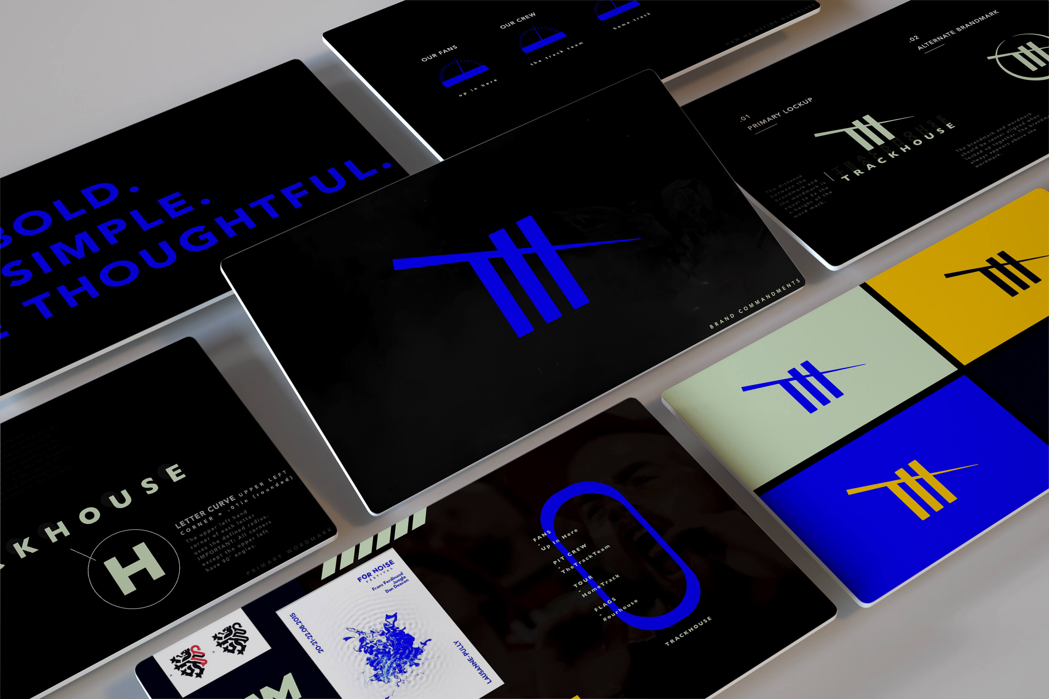


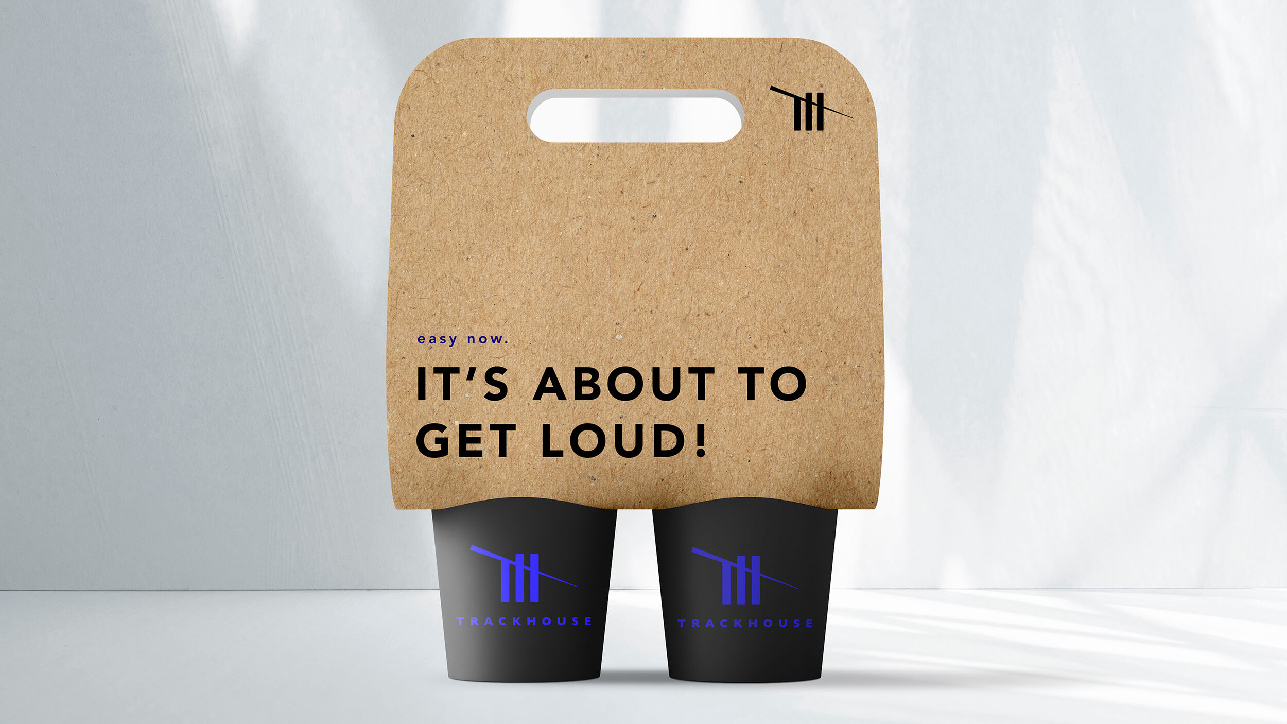
With a name like Trackhouse, the visual language had to be built with the same sense of bold humility. We started with three pillars:
Crafted. Raw. Authentic.
Those weren’t buzzwords—they were directional cues for every asset we built.
Trackhouse wasn’t going to shout. It was going to cut through.
We gave it a look that didn’t require NASCAR literacy to understand. You didn’t have to know racing history to wear the gear. It just looked good. Felt right. Invited people in.
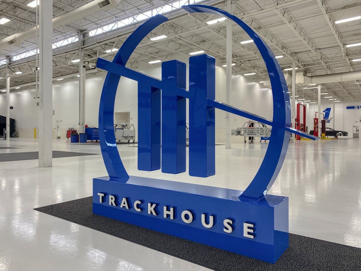
The mark quickly evolved beyond signage—it became a badge. A signal.
On the voice and tone front, we made a conscious decision: this would not sound like a traditional sports team. No empty clichés. No “leave it all on the track” nonsense.
We wrote a new playbook.
Our language was about inclusion, not intimidation. We designed for the fan who just discovered racing through Spotify, TikTok, or a Netflix docuseries. The new fanbase. Younger. Broader. More diverse.
The official tagline?
Be Bold. Be Simple. Be Thoughtful.
It wasn’t marketing fluff. It was a philosophy we applied across naming, social, merch, signage, team communications, and even sponsorship decks .
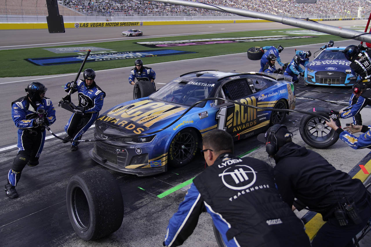
Trackhouse launched with a vision and a vibe—and then it raced.
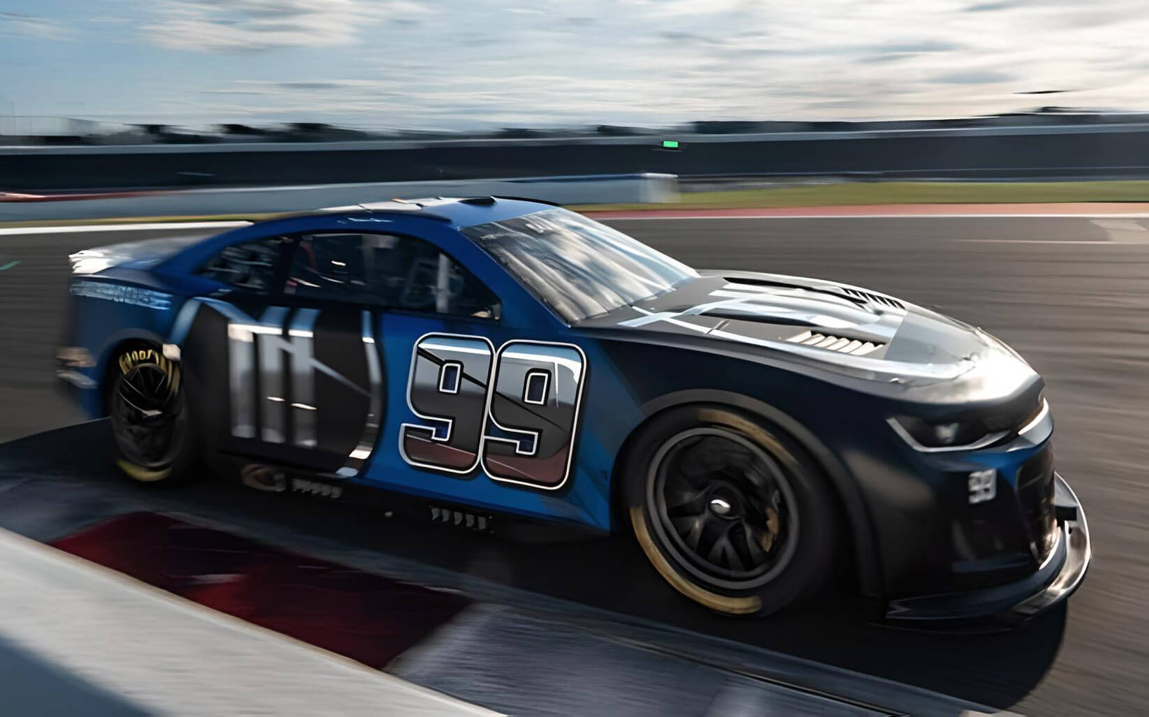
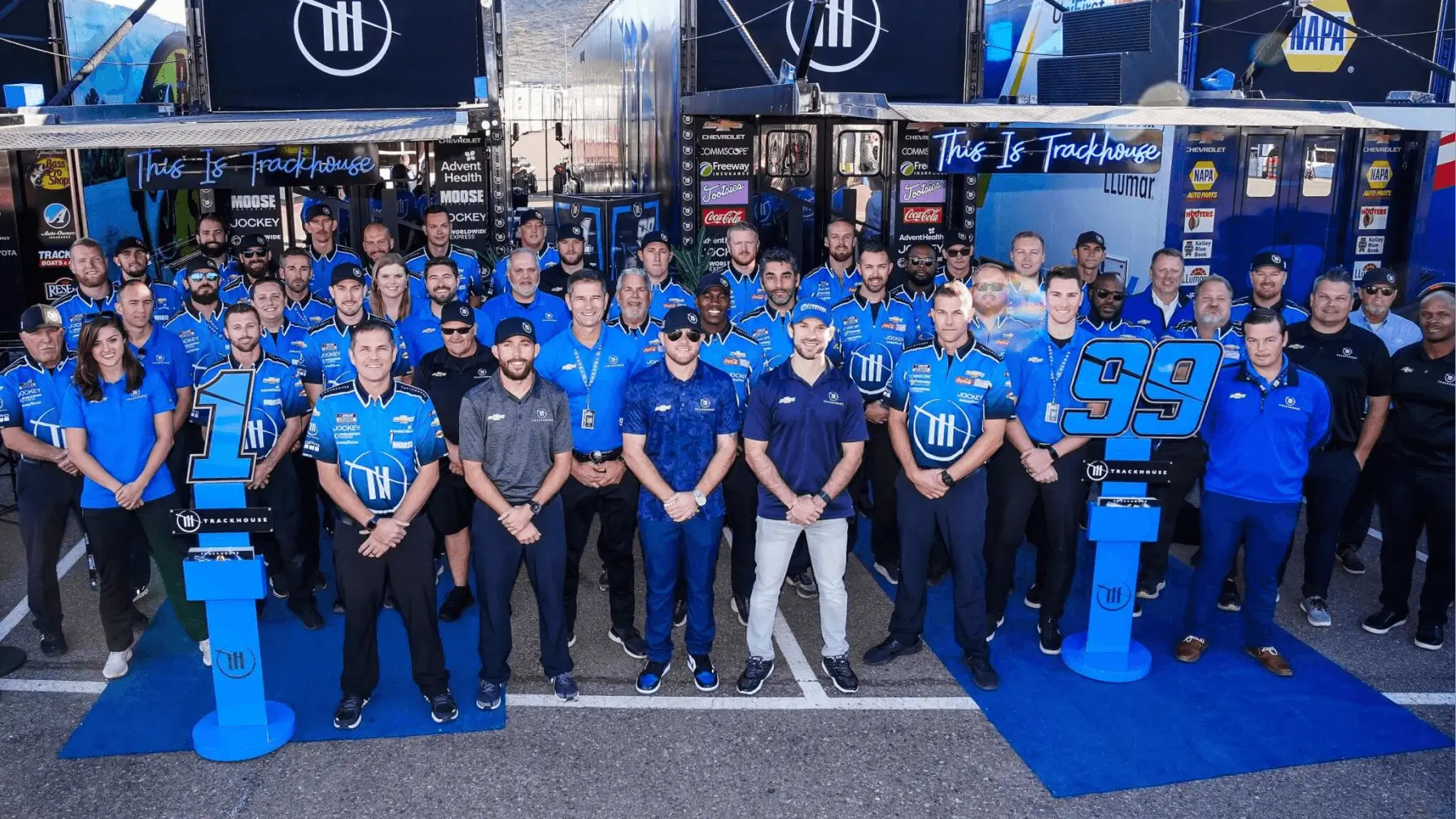
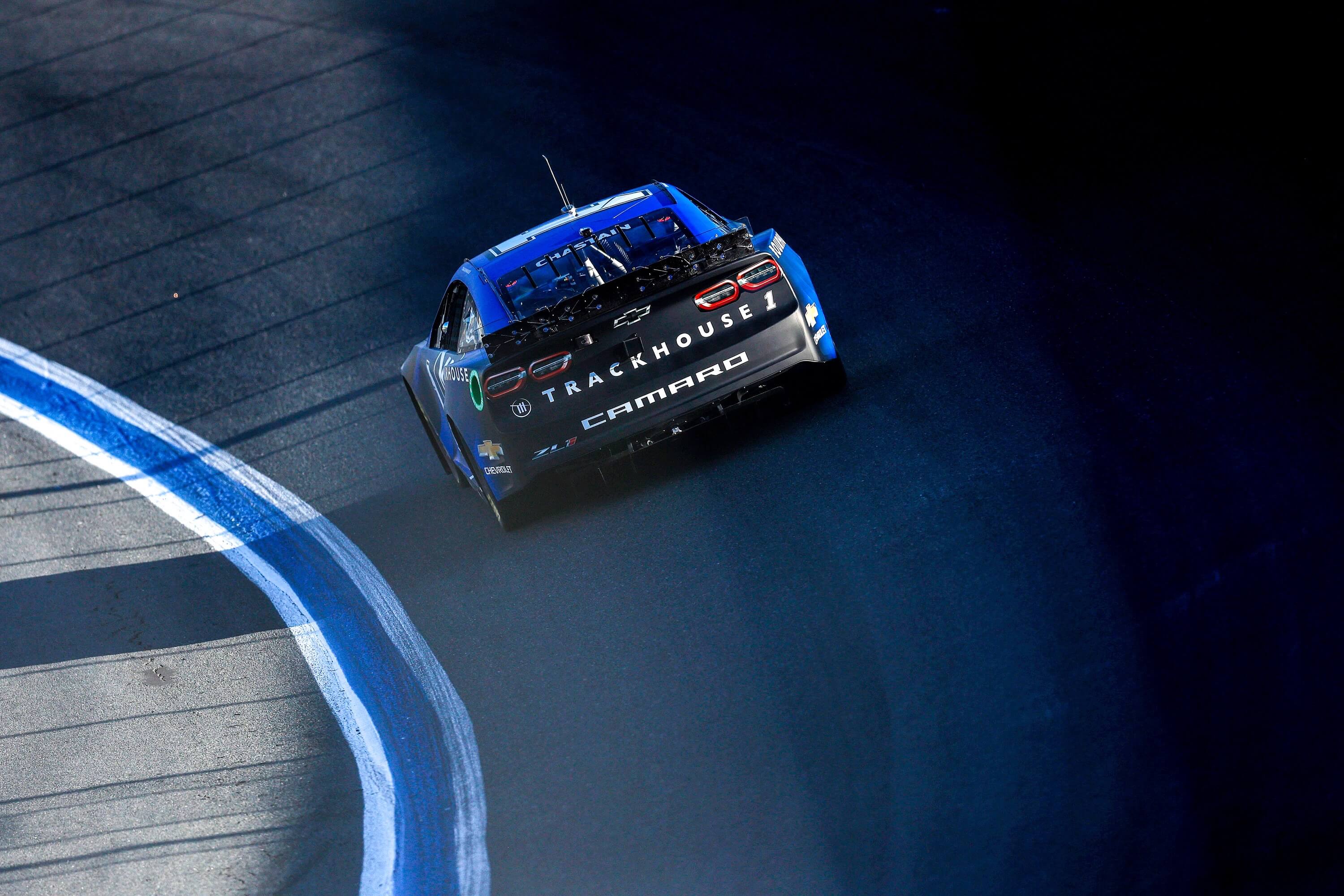
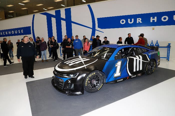
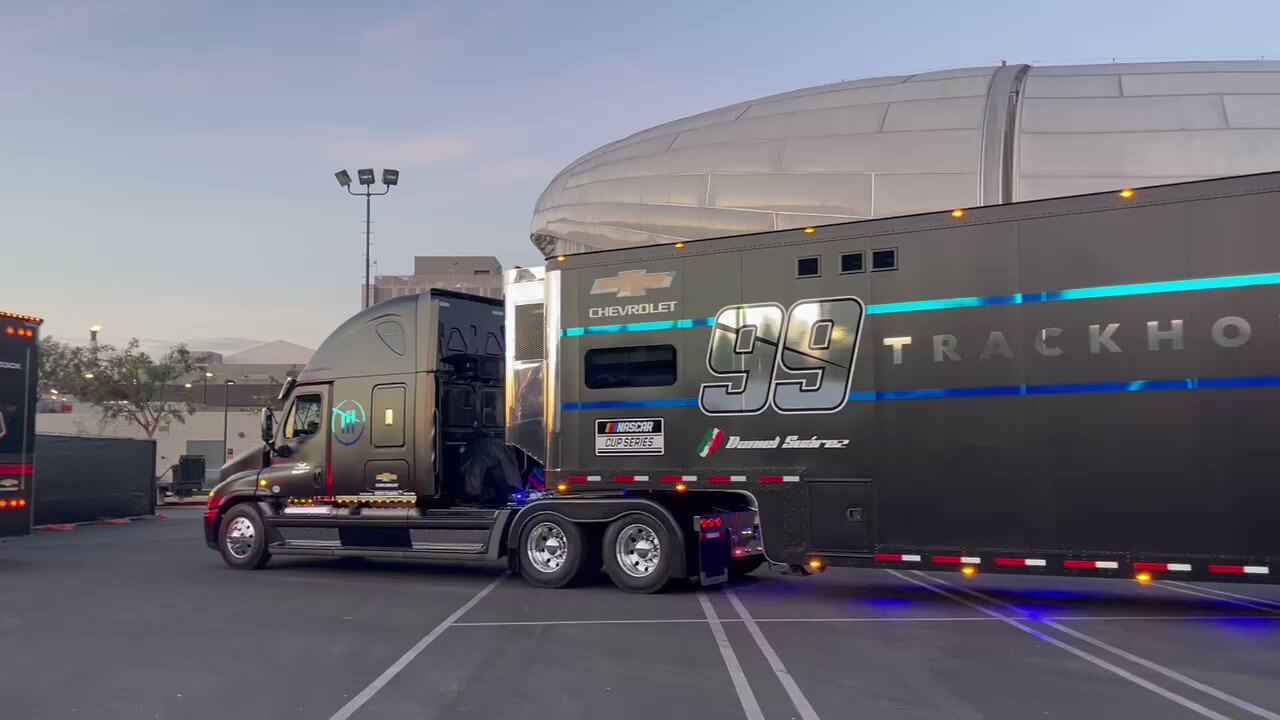
From the first liveries on the No. 99 car to the architecture of the team’s new HQ, the brand was everywhere. Every touchpoint, from the team uniforms to the press kits, carried the same graphic discipline and story-forward spirit .
And the culture followed.
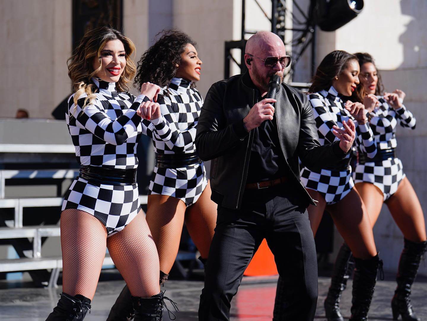
Trackhouse was now a brand that people outside the sport wanted to touch. Collaborate with. Wear.
Even Sports Business Journal and major outlets took note—calling it “the most forward-thinking brand in NASCAR.”
And to be clear: this wasn’t just about looking different. It was about being different. Justin Marks’ team won on the track too. Wins came fast. The fanbase got louder. And our mark—those five tallies—kept stacking up.
From the start, we treated this like a venture-backed startup, not a legacy motorsports brand.
This wasn’t branding for the sake of branding. It was identity infrastructure, ready to scale.