Contact Us
Careers
FAQ

Color as a Forecast, Not a Finish
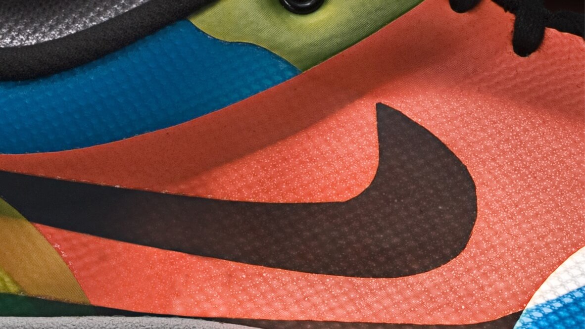
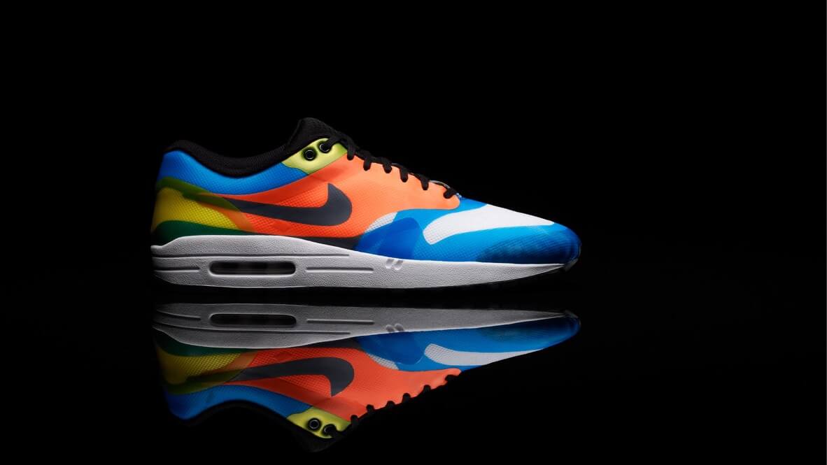
In the early 2000s, I sat on Nike’s Global Color Committee, a multidisciplinary team responsible for forecasting color stories two to three years into the future. It wasn’t just about seasonal palettes or trend decks—it was a calculated blend of science, culture, intuition, and psychology. At Nike, color wasn’t cosmetic. It was strategic. We were crafting emotional responses before the product even launched.
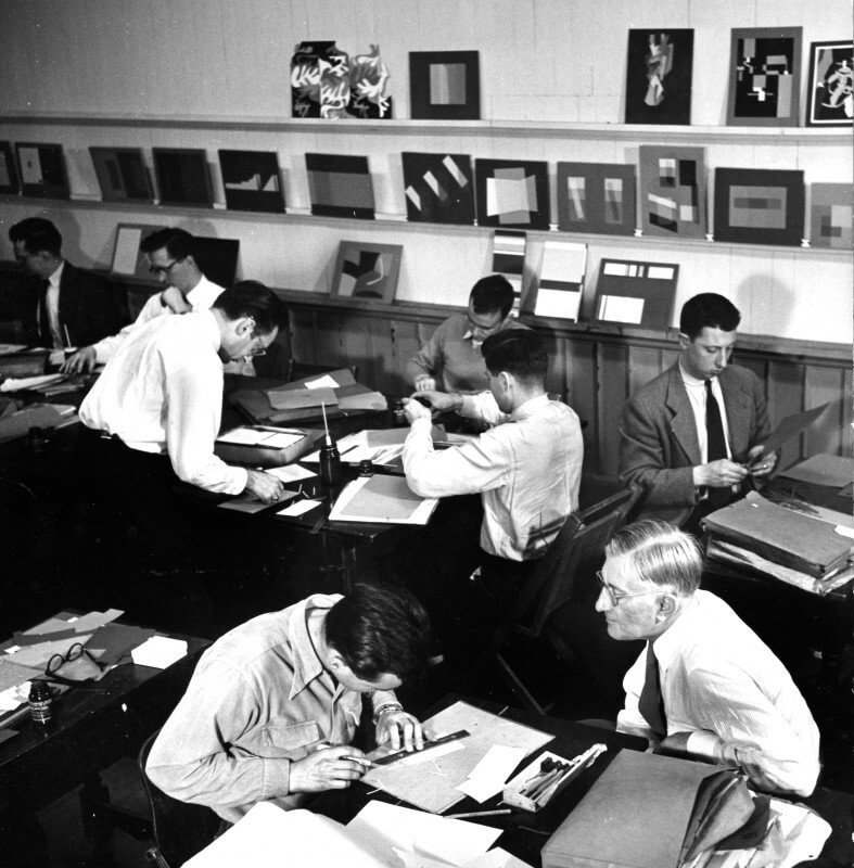
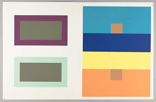
We tested color with consumers across regions, cross-referenced macrotrend forecasts, and considered the emotional cadence of entire product lines. One of the most impactful experiences came when I invited Richard Lytle to campus—a student of Josef Albers, arguably the most influential color theorist of the 20th century. Richard spoke to a packed auditorium of over 600 Nike designers and led color workshops that challenged how we see, feel, and think.
His message was clear: color is not absolute. It shifts based on context, environment, and even mindset. That foundational principle has guided my work ever since, from global consumer goods to branding for hospitals, nonprofits, and financial institutions.
This article is part science, part story—a dive into how color continues to shape identity, foster emotional connection, and create brands that people trust.
Color works faster than language. Before your brain deciphers a word or recognizes a logo, it responds to hue, contrast, and saturation. According to research published in the journal Management Decision, color accounts for 62% to 90% of first impressions. That makes it one of the most powerful tools in branding—and one of the most overlooked.
We associate red with urgency, passion, and risk—which is why it’s so prevalent in fast food and clearance campaigns. Blue builds trust and conveys calm, making it a staple in finance and tech. Green has strong ties to sustainability, health, and renewal. These associations are partly cultural but also physiological.
Chromotherapy, or healing through color, dates back to ancient Egypt, China, and India. Practitioners believed that specific colors influenced the body’s energy systems. In modern applications, blue light is used to treat neonatal jaundice, and warmer tones are often integrated into educational environments to promote focus and alertness.
A particularly compelling study by Henner Ertel found that schoolchildren exposed to classrooms painted in yellow, orange, light green, and sky blue showed a 12-point increase in IQ scores. The same study observed improved behavior and social cohesion. Even blind students experienced benefits, suggesting that our bodies respond to light and color energy beyond visual perception.
What does this mean for branding? Color is not just visual. It’s biological. It can stimulate or calm, focus or distract, attract or repel.
And when used strategically, it can turn a passive audience into active believers.


In branding, every choice signals intention. Typography, tone of voice, photography style—they all matter. But color often does the heaviest lifting, especially in split-second decision-making.
We trust blue. Think of Visa, IBM, and LinkedIn. These brands aren’t just relying on nostalgia or coincidence—they’re leveraging the psychological weight of color. Red can energize, but too much of it and you risk evoking danger. Green reads clean, but the wrong tone might skew toward sterile or immature.
I once worked with a healthcare nonprofit undergoing a rebrand. One of the most hotly debated aspects was color. The organization served individuals on the autism spectrum, many of whom had sensory sensitivities. We had to carefully test palettes not only for visual identity but also for emotional resonance, inclusivity, and accessibility.
Color sets the tone for trust. And trust is the emotional ROI of branding.
At Watson, we often run into this in our stakeholder workshops. During brand discovery, we don’t just ask clients what colors they like. We ask how they want their audience to feel. Then we explore how hue, saturation, and contrast can help bridge the gap between intention and perception.
One in 12 men and one in 200 women worldwide experience some form of color blindness. That’s approximately 300 million people. Add to that the rising demand for digital inclusivity, and it becomes clear: accessible color usage is no longer optional.
The Web Content Accessibility Guidelines (WCAG) mandate minimum contrast ratios between foreground and background colors. But accessibility goes beyond compliance. It’s about equity.
At Watson, we build brand systems where color is foundational, not decorative. For a project with a state agency focused on health and equity, we rigorously tested every color in the visual system across ADA standards, ensuring they worked in print, web, signage, and even video overlays. We involved users with low vision and neurodivergent feedback loops. The result wasn’t just accessible—it was more effective for everyone.
Accessibility also means understanding how color performs across materials. A digital green may look sharp on a screen but turn muddy when printed on recycled stock. A vibrant hue might work well on social media but blur in motion graphics.
Designing for accessibility is designing for longevity.
Two decades ago, brand color selection often meant pointing at a Pantone swatch and hoping it held up across signage, packaging, and apparel. Fast forward to today, and color is part of a responsive design system—it needs to flex across dark mode, adaptive interfaces, and global cultural interpretation.
At Watson, we’re seeing more brands adopt what we call color intelligence: a data-informed approach to color selection that blends trend forecasting, cultural insight, accessibility standards, and emotional impact.
We use macrotrend frameworks to predict color movement over 12-36 months. Some of the themes we track include:
The next wave of branding will embrace dynamic palettes—systems that adapt based on user preference, time of day, or content context. Spotify and Netflix already experiment with this. As AI and real-time personalization expand, so will color’s role in shaping user experience.
Color isn’t fixed. It’s a living language.
If you’re building or evolving a brand, use this as a gut check:
We’re entering an era where brand systems aren’t static—they flex. Just like Spotify curates mood-based playlists, future brand systems will shift palettes based on emotional data. Imagine a health app adjusting its color tone based on your sleep score. Or a learning platform that tailors its interface to match cognitive load.
In this mood-responsive future, color isn’t just expressive—it’s empathetic.
Watson is already helping clients prototype these systems. Using real-time feedback loops, motion design, and modular brand systems, we ensure that color supports not just aesthetics, but behavior.