Contact Us
Careers
FAQ

For nearly six decades, the Autism Society of America has been a lifeline—connecting individuals and families with the resources they need through education, advocacy, and support. But even legacy institutions must evolve.
Facing a rapidly expanding population of Autistic individuals—and the shifting cultural narratives around diagnosis, language, and identity—the Autism Society recognized it was time to reimagine its brand. Not just visually. Strategically. Inclusively. Authentically.
The organization’s leadership wasn’t interested in surface-level change. They envisioned a bold, future-forward brand—built with the community, not just for it. One that could reflect the spectrum of lived experiences, affirm dignity across identities, and unify a national network of 75 affiliates under one cohesive voice.
What they needed was more than a new logo or tagline. They needed a rebrand that could carry the emotional weight, political nuance, and operational demands of leading the Autism movement forward.
For Watson, the challenge was clear: build a brand strategy rooted in connection—but also in clarity.
The Autism Society’s previous identity didn’t reflect the sheer diversity of its community or the evolving language around Autism. There was no consistent definition or messaging framework across affiliates. No shared rallying cry that felt both grounded and actionable.
To get it right, the rebrand would have to:
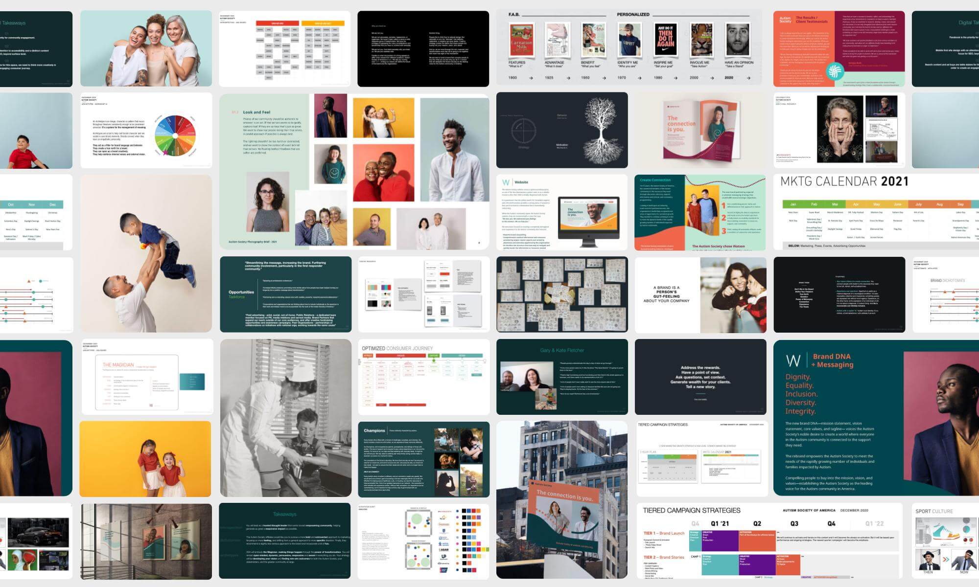
We began with research. Not just surveys and white papers, but conversations. More than 150 stakeholders engaged over the course of a year: Autistic self-advocates, parents, caregivers, affiliate directors, researchers, board members, and community partners.
The process was intentionally slow. Respectful. Immersive.
We facilitated interviews, workshops, and roundtables with:
Our team held daily alignment meetings, ensuring the pace of decision-making was steady—and feedback loops stayed human.
In our audit, one insight rose above the rest: disconnection.
Disconnection from resources. From one another. From a sense of shared narrative.
That became our North Star. Connection wasn’t just a messaging theme. It was the strategic lever.
It became clear that the new brand had to offer:
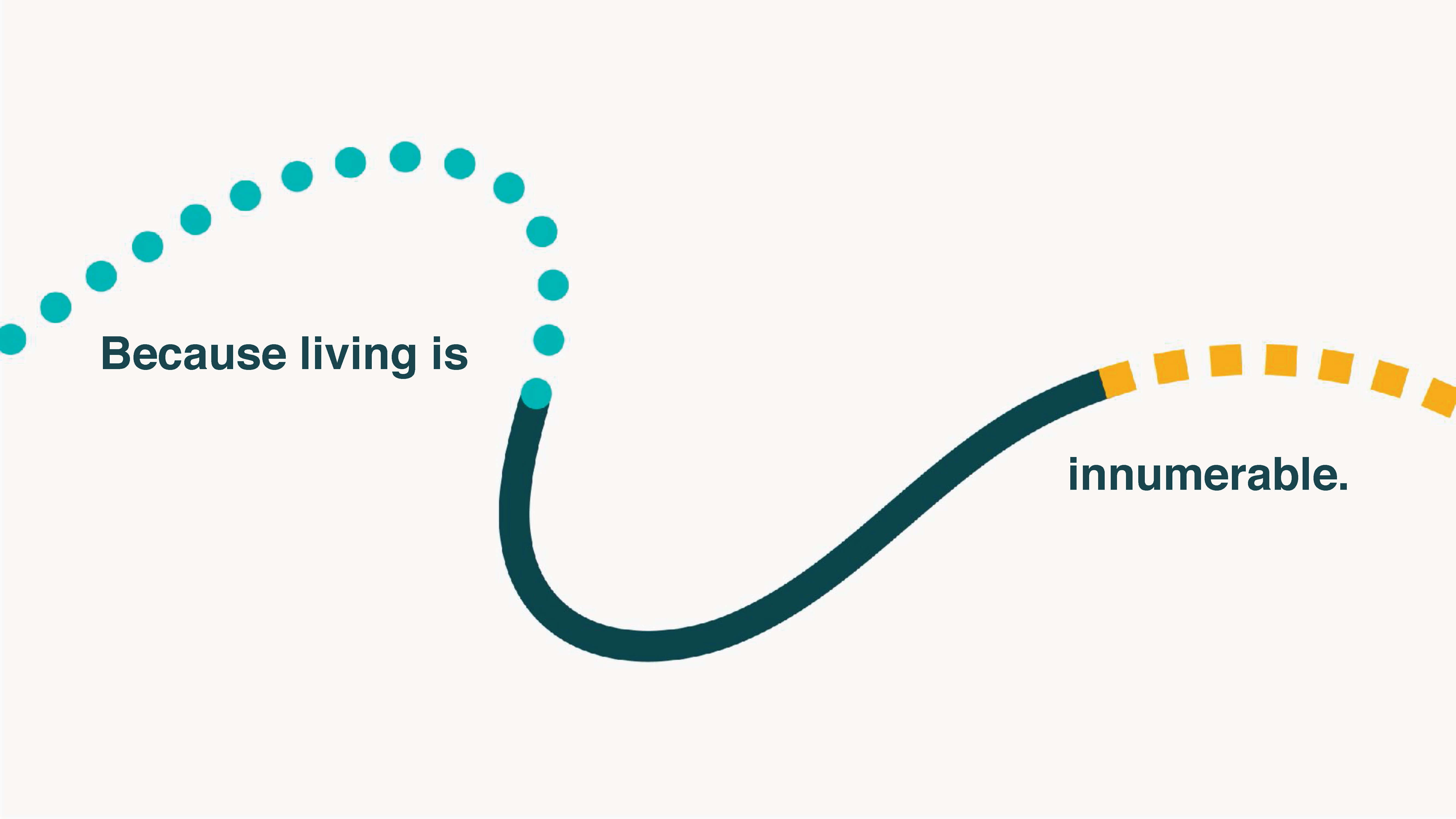
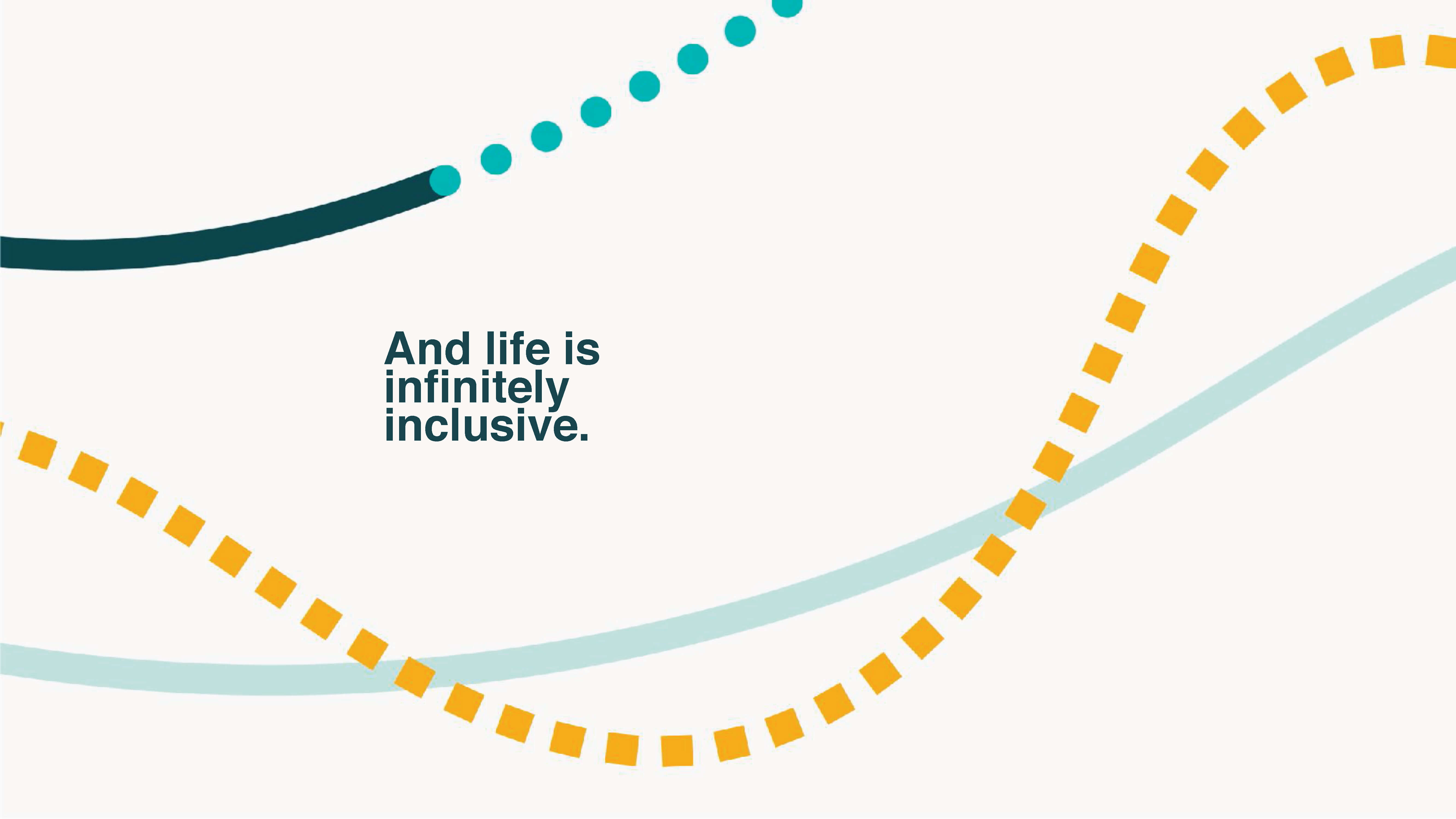
“Because of our commitment to inclusion and the recognition of the innumerable experiences within the Autism community, our brand had to express our core values and the connections that tie our diverse community together.”
Kristyn Roth – CMO, Autism Society of America
From color palettes to web UX, our creative strategy prioritized accessibility—not just ADA compliance, but sensory inclusion.
Every design element was tested with Autistic individuals and caregivers. Fonts, contrast, motion, and navigation patterns were adjusted based on feedback. We adopted WCAG standards as a floor, not a ceiling.
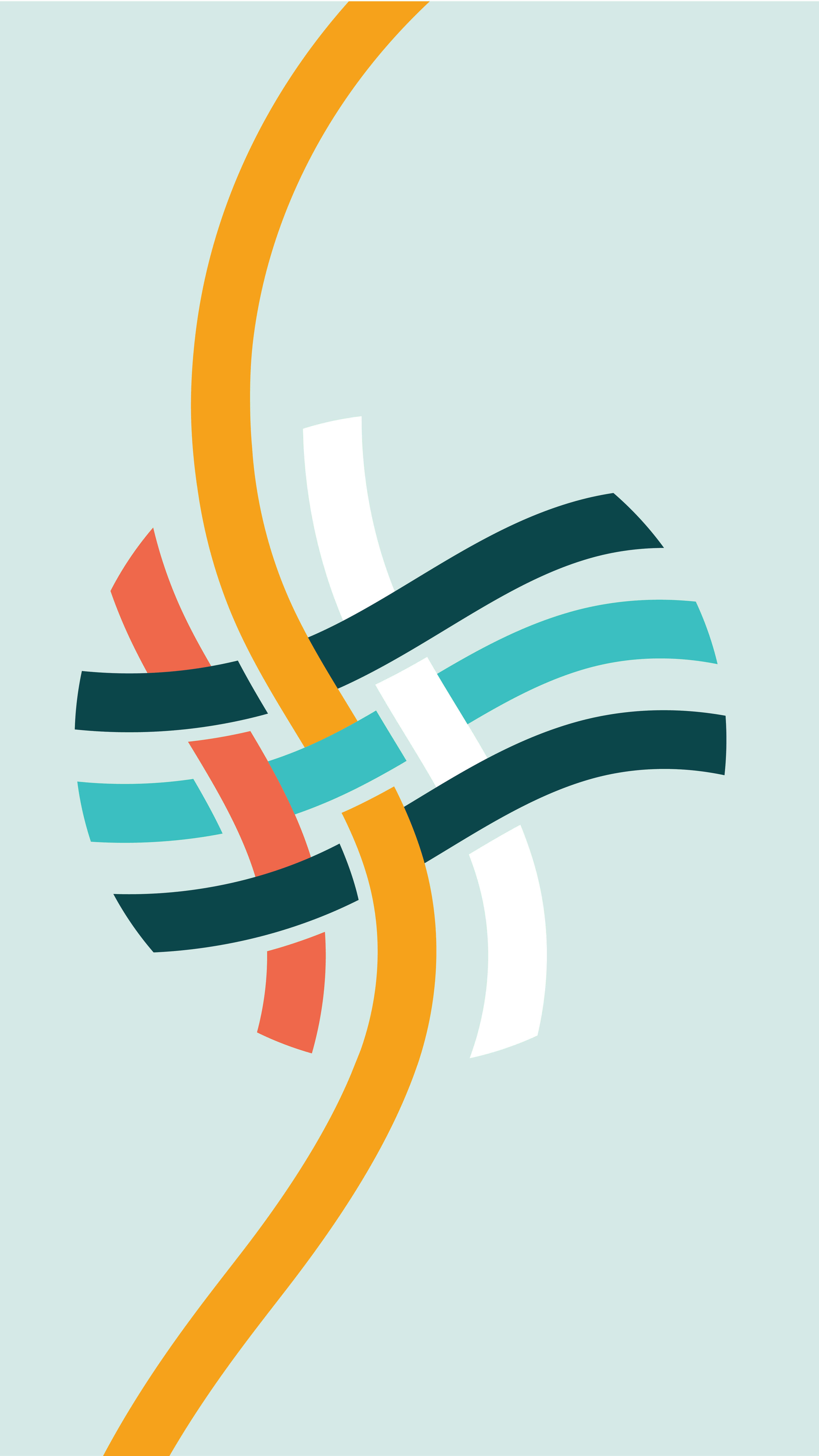
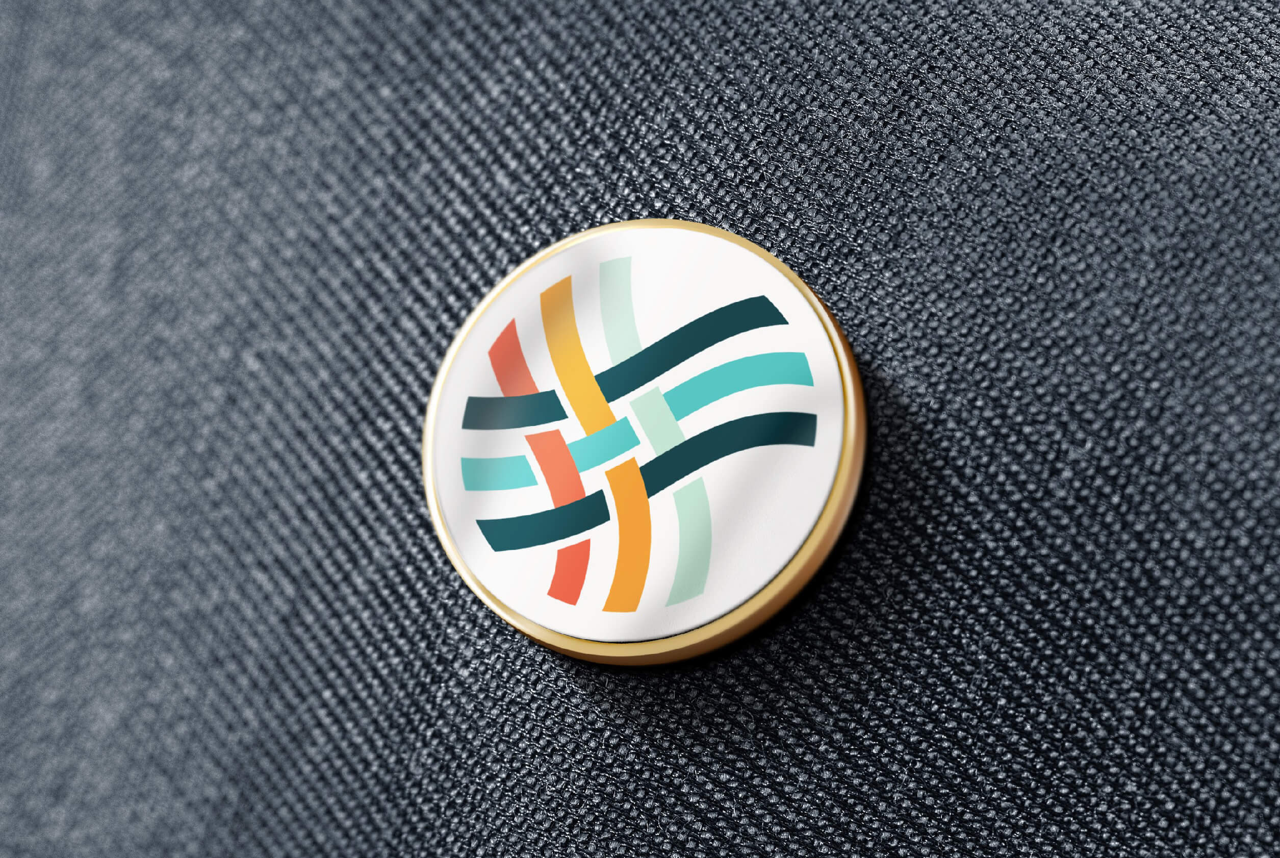
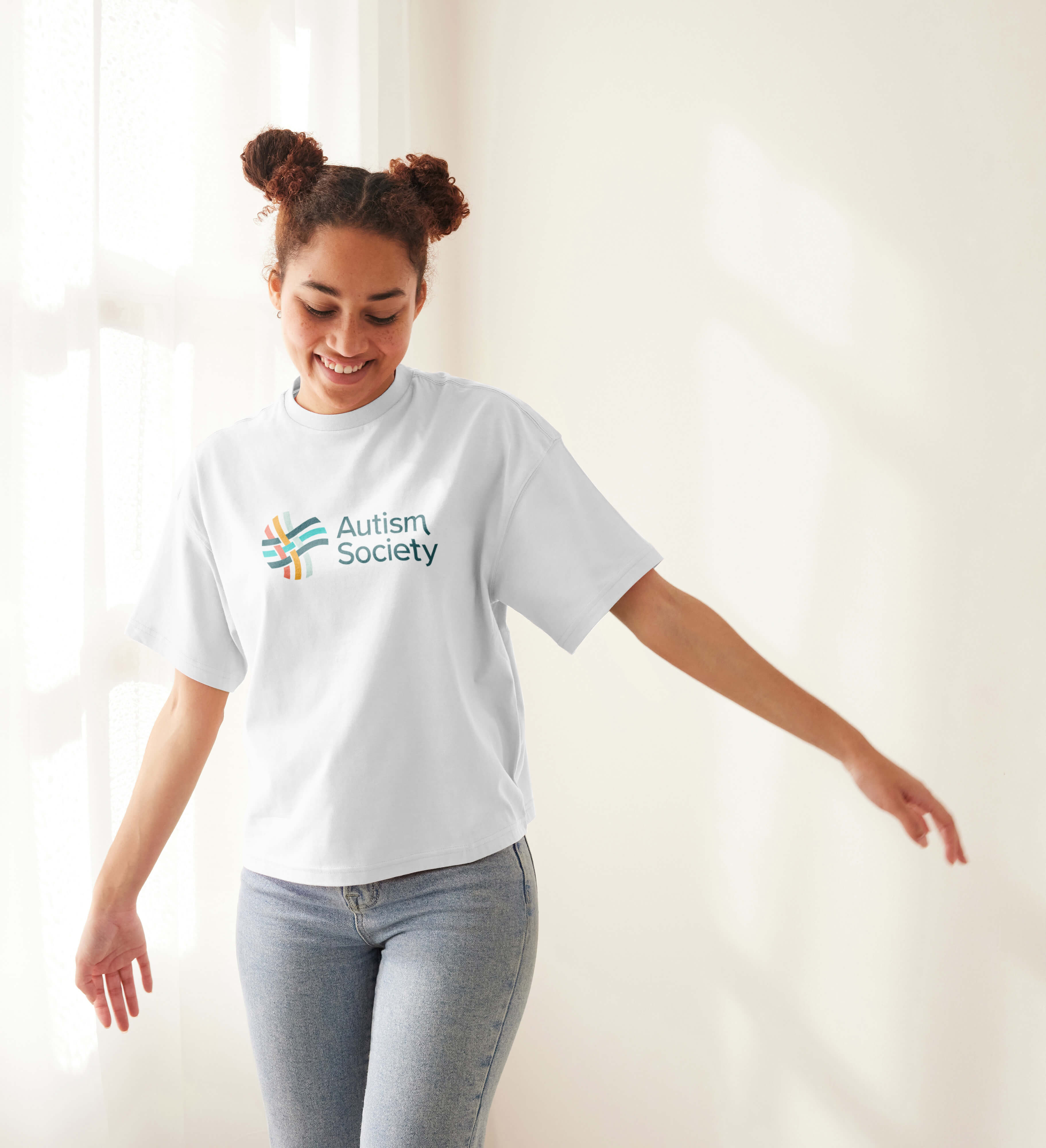
We anchored the creative system around a visual thread—literally. Fluid lines and soft shapes signified the interconnectedness of people across the spectrum. The toolkit now includes:
“To create connection, empowering everyone in the Autism community with the education and resources they need to live fully with dignity, equality, and recognition.”
Matt Watson – CEO, Watson
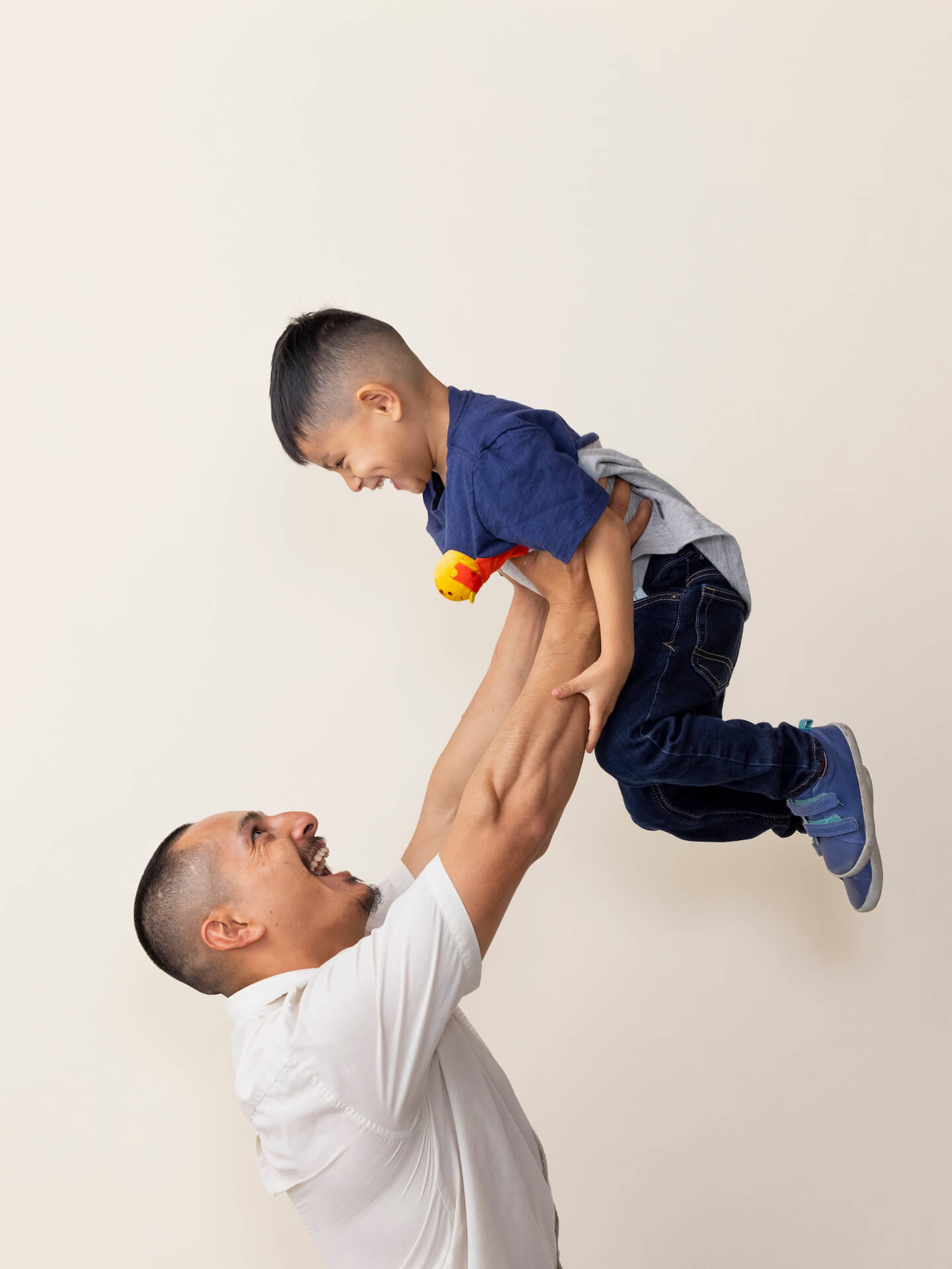
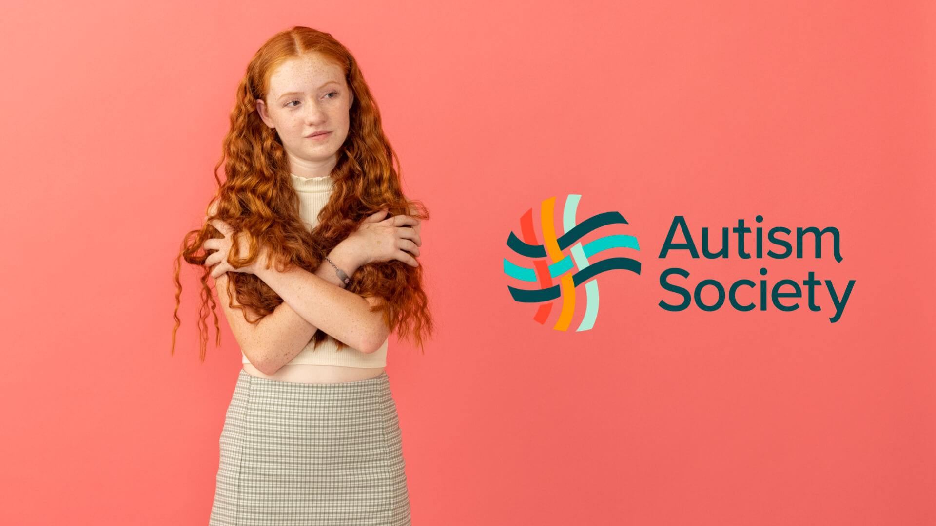
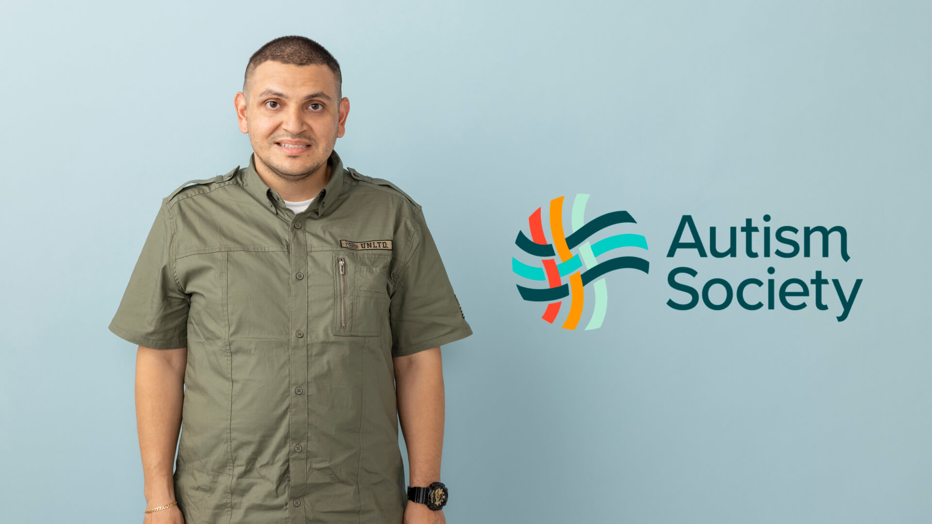
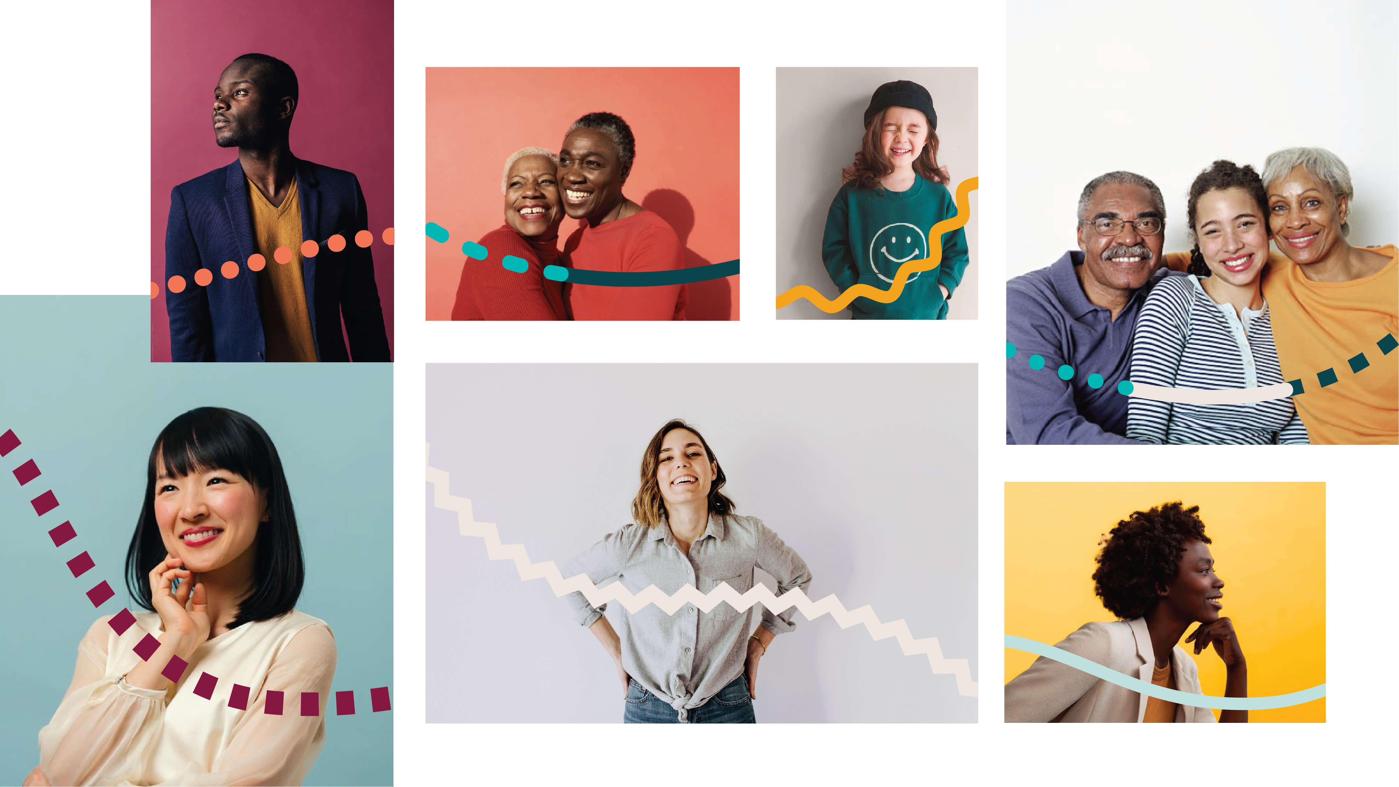
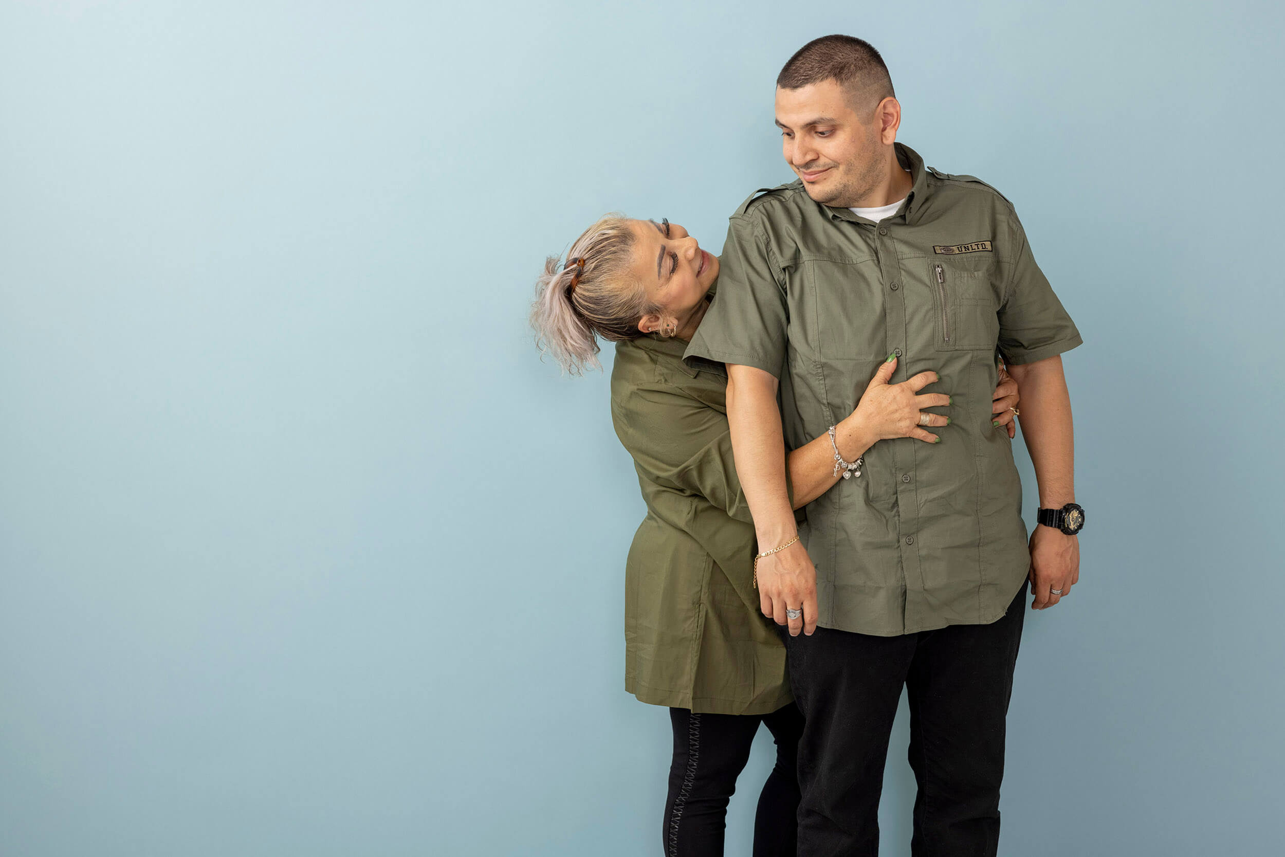
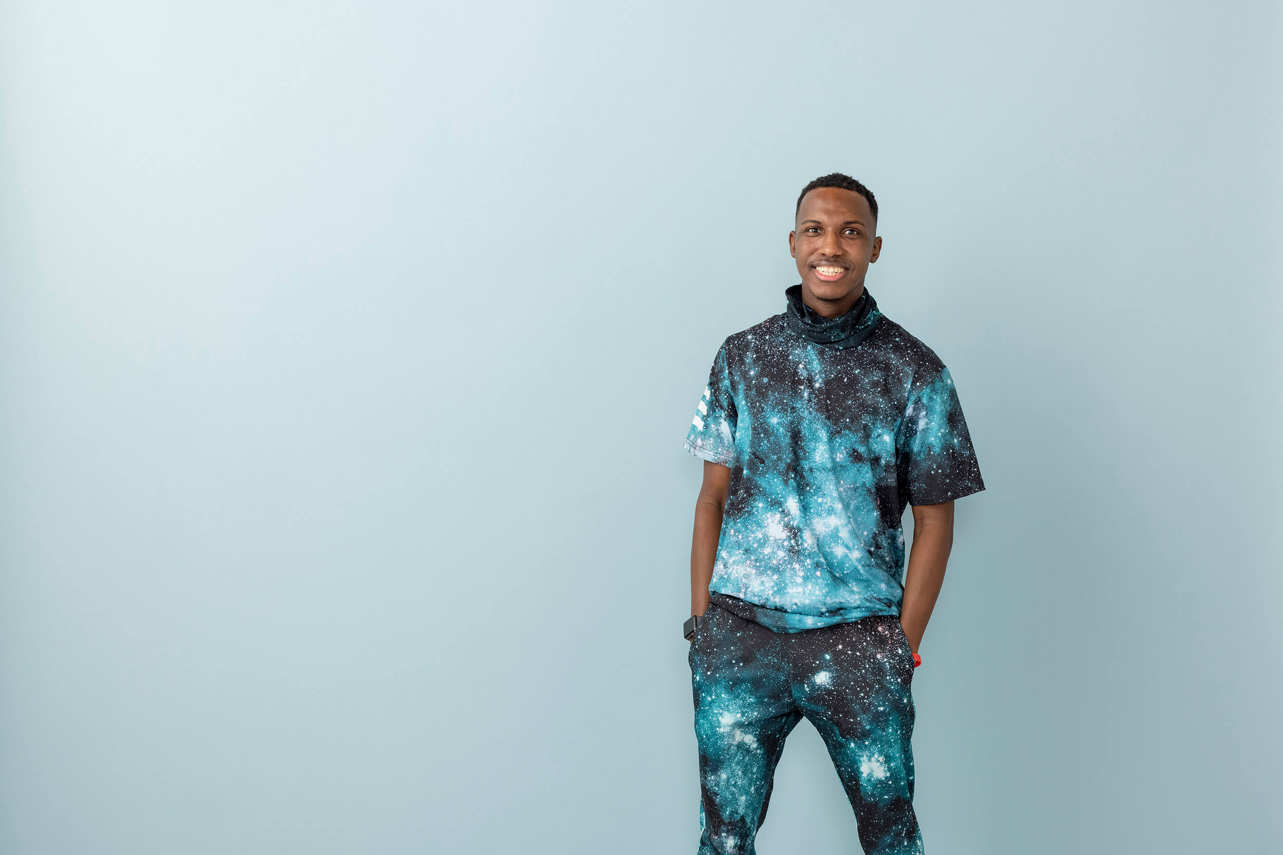
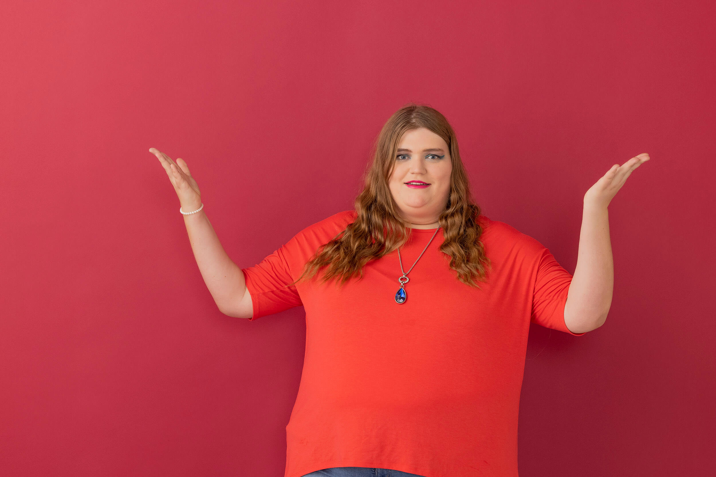
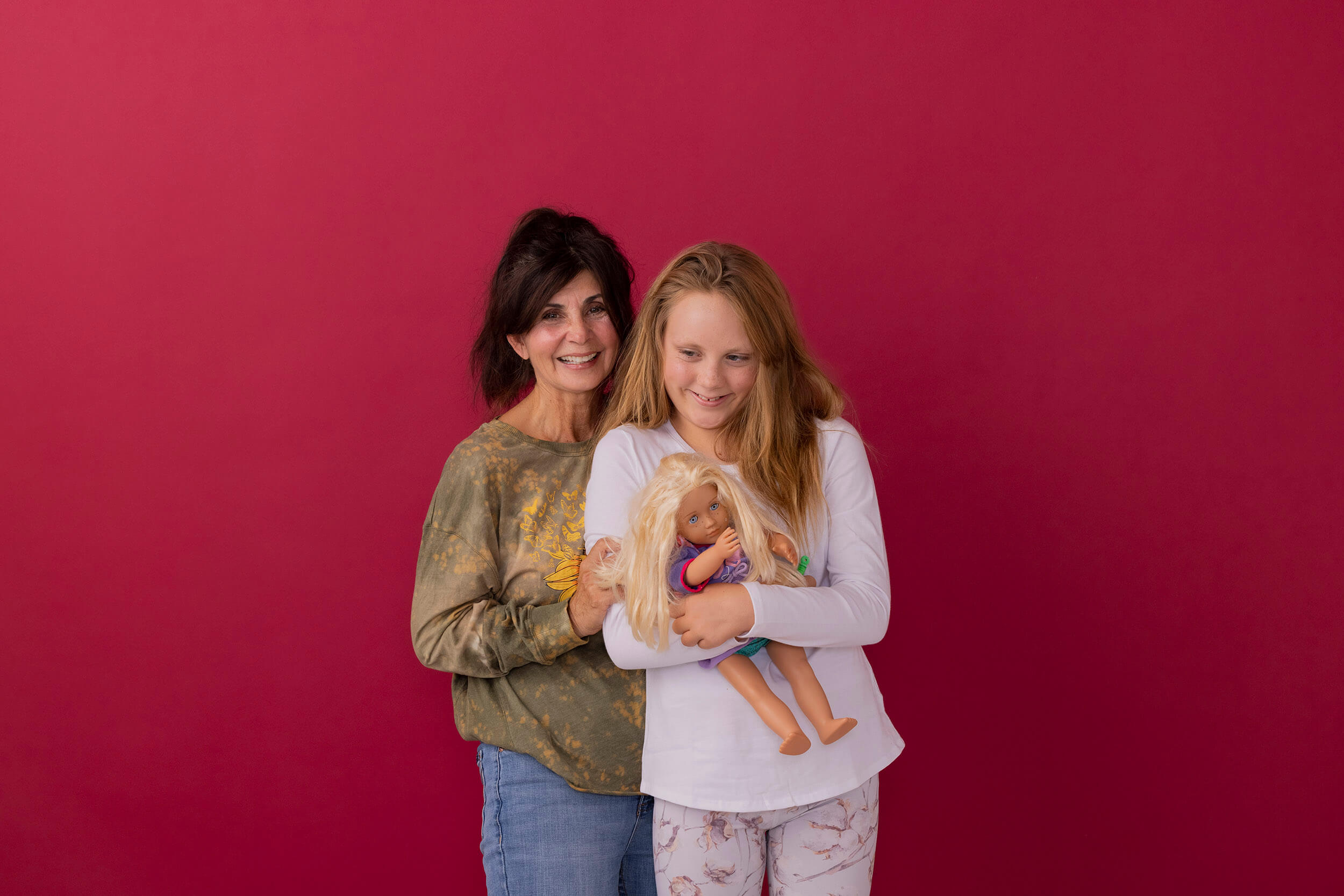
One of the most moving aspects of the project was the photo shoot.
Participants stepped outside their comfort zones. Some allowed their parents to touch them for the first time. The emotion in the room was palpable—captured in a brand library that now reflects the strength, variety, and authenticity of the Autism community.
The visuals weren’t curated. They were lived.
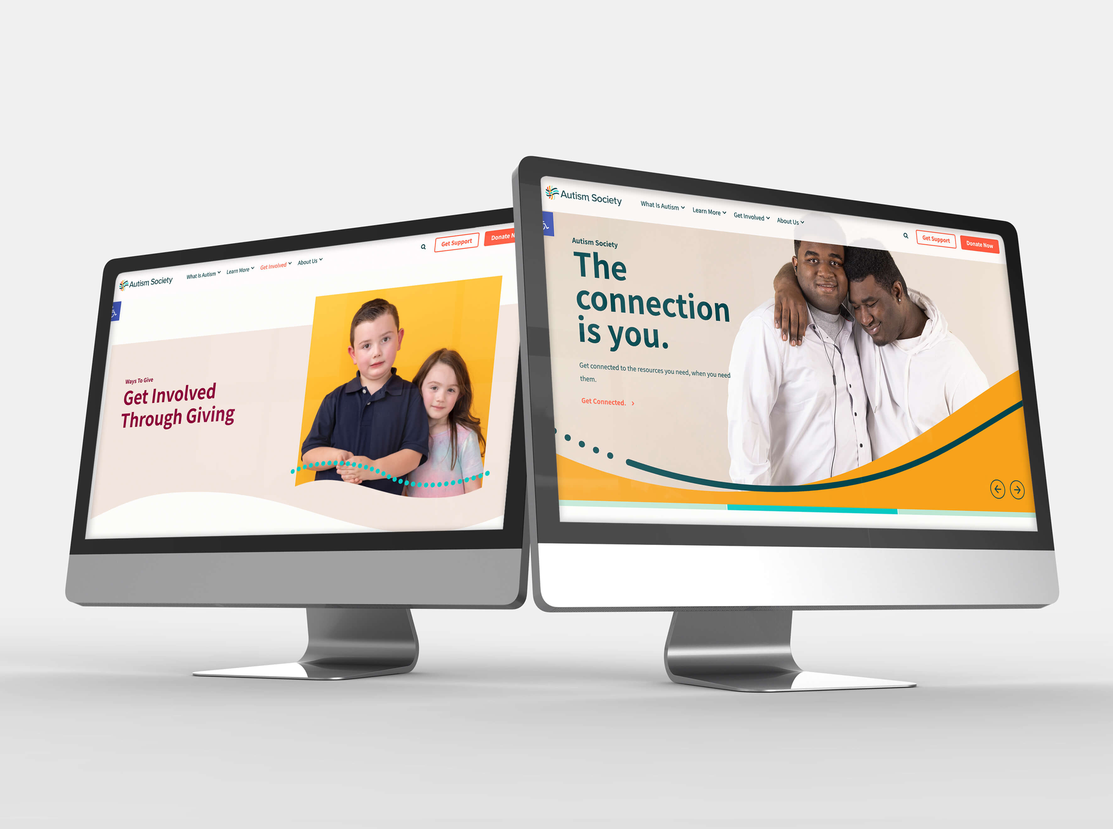

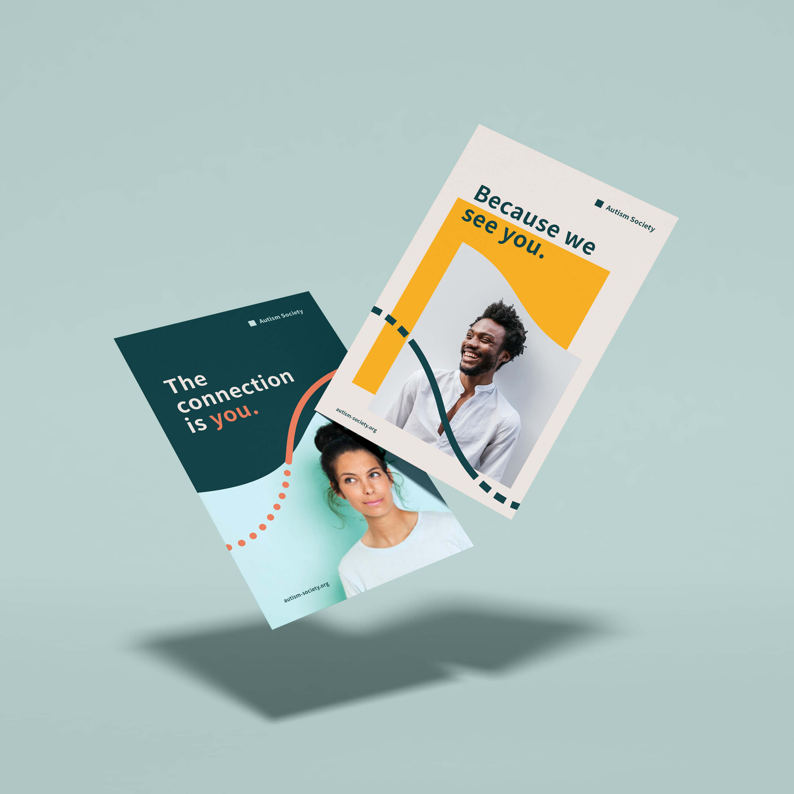
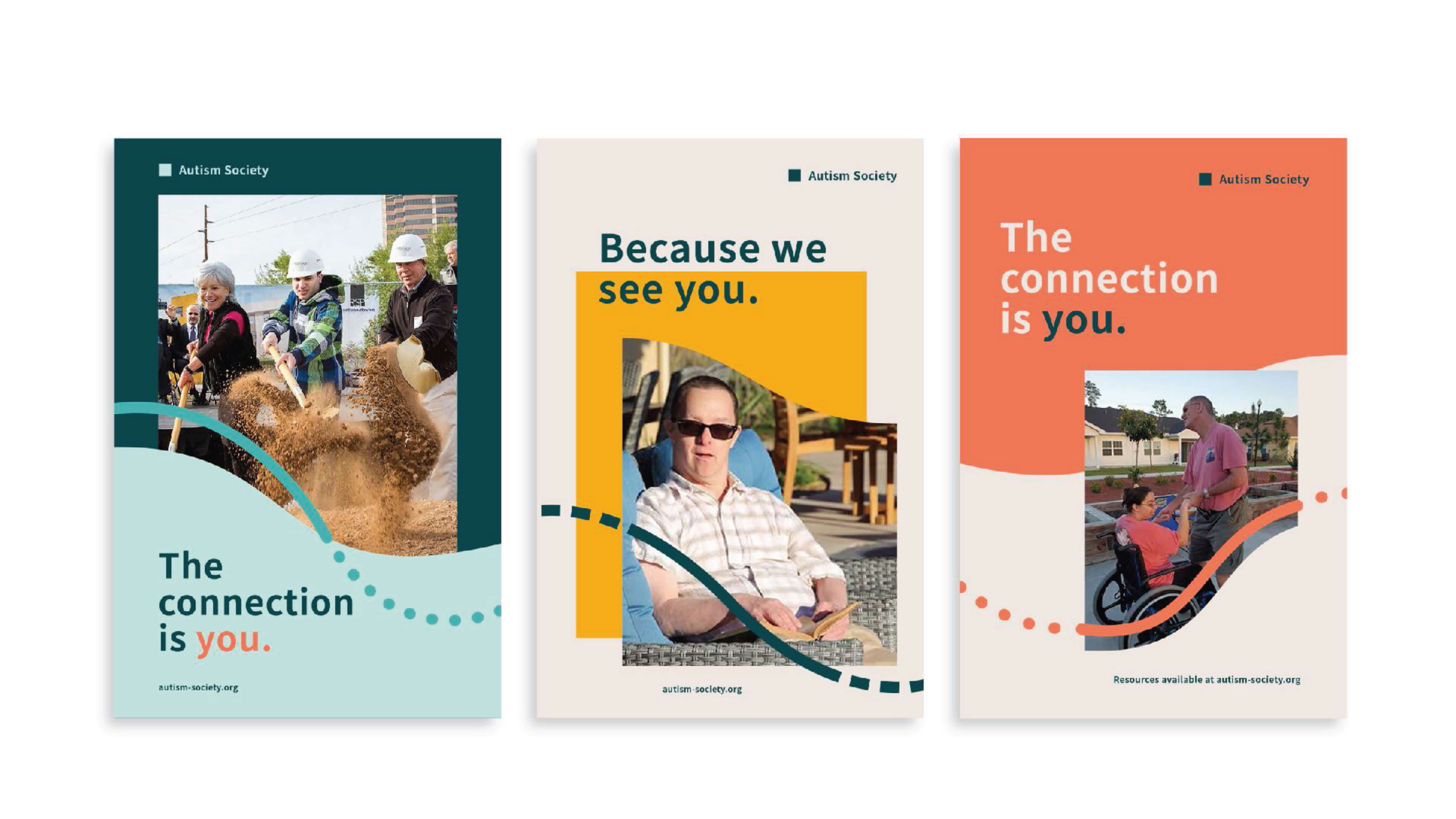

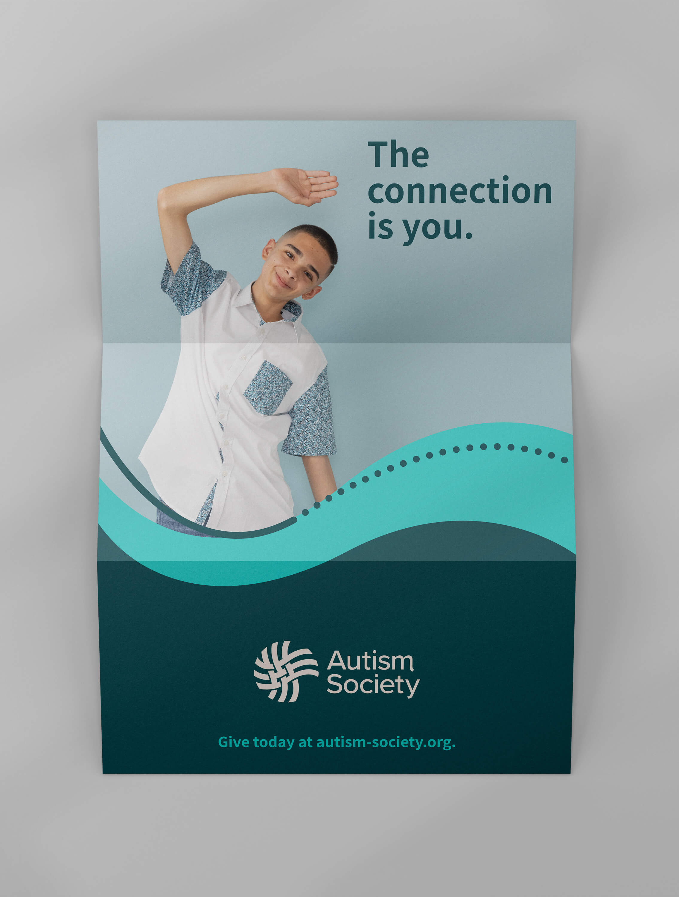


The breakthrough moment came with a deceptively simple phrase: The Connection is You.
It wasn’t just a tagline. It was a call to action—one that gave ownership to every member of the community.
“When you come to the Autism Society looking for information, you are the connection. When you create a local support group for fathers of Autistic children, you are the connection.”
For many families, the website is the first place they turn after a life-changing diagnosis. It needed to be as welcoming as it was informative. We redesigned the entire digital experience around a single emotional message: We hear you. We’re with you. The new site features:
To support long-term sustainability, Watson delivered a full brand system: from messaging guidelines and visual toolkits to affiliate onboarding resources.
This ensures that every chapter, no matter the size, can align with the national brand while adapting for local needs.
We designed for coherence—not uniformity
“We are hearing tremendously favorable comments about the new logo, the look of the website, the identification with The Connection is You tagline, the images, and so much more. The messaging is resonating with the greater community.” Christopher Banks – President and CEO, Autism Society of America
“Our new brand is part of the critical foundation of the Autism Society’s forward-looking Strategic Plan. It clearly supports the path forward for the Autism Society and improved connection to the communities we serve.” Brian Roth – Board Member, Autism Society of America
“Our affiliates finally have branding they’re proud of—and were so eager to implement.”Kristyn Roth – CMO, Autism Society of America
Rebrands done to a community will fail. Rebrands done with a community create movements. The Autism Society invited stakeholders in early—and never shut the door.
A nonprofit brand needs more than logic and service lists. It needs emotional infrastructure—language, visuals, and interactions that meet people where they are.
ADA compliance isn’t enough. Design for real-world scenarios, like sensory barriers, first-time diagnosis moments, and people searching for hope at 2 a.m.
Rebranding the Autism Society wasn’t about replacing an identity. It was about revealing one that was already there—waiting to be seen, heard, and shared. The real brand isn’t a logo or a font. It’s the self-advocate on Capitol Hill. The exhausted parent finding community. The child who, for the first time, sees themselves in a photo. This is what nonprofit branding can do when you start with people.
Rebrands done to a community will fail. Rebrands done with a community create movements. The Autism Society invited stakeholders in early—and never shut the door.
A nonprofit brand needs more than logic and service lists. It needs emotional infrastructure—language, visuals, and interactions that meet people where they are.
ADA compliance isn’t enough. Design for real-world scenarios, like sensory barriers, first-time diagnosis moments, and people searching for hope at 2 a.m.
Rebranding the Autism Society wasn’t about replacing an identity. It was about revealing one that was already there—waiting to be seen, heard, and shared.
The real brand isn’t a logo or a font. It’s the self-advocate on Capitol Hill. The exhausted parent finding community. The child who, for the first time, sees themselves in a photo.
This is what nonprofit branding can do when you start with people.
With gratitude,
Watson


