Contact Us
Careers
FAQ
There’s a moment that sticks with me. San Diego. A high school kid laced up a pair of Nike Free 5.0s, took two steps, and grinned.
“Float like a butterfly, sting like a bee,” he said.
That line wasn’t in the brief. It wasn’t in the data. It wasn’t from some award-winning agency presentation or a brand strategist’s playbook. But it changed everything.
That phrase became the spark for the final visual we created—an all-red butterfly, abstract and surreal, centered around movement and emotion. At the time, red was Nike’s worst-performing colorway for that product. The design was wildly irrational. We even broke form by changing the tagline. And yet, that single piece of creative drove a 97% click-through rate and 41% purchase conversion—a number that still makes marketers pause mid-sip.
It took a decade in this business and one very humbling experiment with Nike to fully grasp the power of irrational, research-backed creative. That moment made it clear: the difference between good and great isn’t logic—it’s what you feel in your bones before you put pen to paper.
The rational mind loves a best-selling color. A bullet-point list of features. A lifestyle photo that hits the demographics. These are the comforts of the marketing world: safe bets backed by historical data.
And for a while in the Nike Butterfly project, that’s where we stayed. On Day 1 of the experiment, we showcased the shoe in its best-selling colorway. The result? A 3% click rate. On Day 2, we added more product features and showed the shoe curled up—a visual people loved. Clicks bumped to 7%, purchases to 5% .
But it wasn’t until Day 5, when we abandoned logic altogether and introduced the bold, red butterfly design—paired with the off-script tagline “Super Natural Move”—that things exploded: 41% conversion and 97% click-through .
That’s the power of irrational, research-informed creativity. It’s not about ignoring data. It’s about going beyond it.
Before we made the butterfly, we hit the road. From the Coast Guard base in Miami to Olympic athletes in Colorado Springs, CIA operatives in D.C., and students in San Diego, we talked, listened, and watched .
We didn’t walk into those spaces with creative ideas already formed. We walked in with curiosity. That’s what changed everything.
At the Air Force Academy Chapel—a structure filled with color, emotion, and light—we remembered why creativity matters. And in San Diego, when that student tried on the shoe and quoted Muhammad Ali, it connected a decade of design instincts with something pure and powerful: emotion.
That insight didn’t come from a focus group or a spreadsheet. It came from being there, listening fully, and leaving the rational behind.
So what can B2B brands learn from a Nike sneaker experiment?
Everything.
Too often, B2B companies box themselves into the rational. White papers. Case studies. Feature-heavy slide decks. Meanwhile, their buyers—who are also humans—are moved by story, beauty, surprise, and confidence.
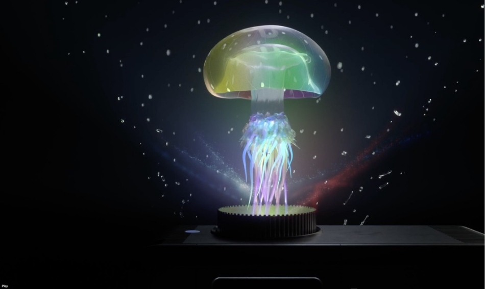
We’ve applied the same irrational-yet-researched creative strategy for clients like ESCO, launching the Nexsys product with a surreal mix of 3D animation and emotional messaging. The mining industry isn’t exactly known for its softness. But the response? Engagement up, sales conversations accelerated .
In financial services, we’ve helped rebrand firms like Percipio Group and Hunter Fans not by focusing solely on spreadsheets and resumes—but by elevating what really makes them different: their people, their mission, their character. Trust isn’t built on rationality alone. It’s built on resonance.
Rebrands often fail because they start with a spreadsheet and stop with a style guide. They try to fix a perception problem without ever engaging with emotion.
We’ve seen it happen in RFPs, especially in higher education and government work. Organizations want creative that converts but fear the risks of anything that doesn’t “test well.” But some of the biggest returns we’ve seen came from moments when we gently challenged those assumptions and invited teams to explore creative beyond the expected.
The key isn’t to abandon reason. The key is to pair it with informed intuition.
So how do you apply this in your own company—especially if you’re not Nike?
Here’s the shift:
One of the biggest surprises in the Nike project? The butterfly was built around red—a color that, historically, didn’t sell. The version we featured wasn’t even in production yet.
But great creative can change perception. When the concept was anchored in story and movement, the irrational choice became magnetic.
What the butterfly represented wasn’t just a design shift—it was a brand posture: bold, agile, willing to take a leap. That posture converted more people than any feature list ever could.

